Trendy Wednesday: Jenna Paniccia
One of my favorite things about event planning is being inspired by the littlest things. Whether it is a color, a word, or picture in a magazine, it is an amazing feeling to be inspired and have a vision come to life.
What inspires me the most is patterns. The idea of mixing and matching patterns allows for a specific type of design and appeal to the eye. Patterns can be used on such a broad spectrum that the idea tends to scare people away. The best thing about using patterns when designing a wedding is that everything doesn’t have to match perfectly.
Most people compare this concept of mixing patterns to clothing. Maybe you wouldn’t wear orange floral pants with a chevron purple top, but let’s think about this in terms of decor design. An orange floral table linen adorned with a purple chevron napkin would give the most elegant contrast. With floral arrangements and glass dinnerware, this combination would be stunning.
My suggestion would be to play with pattern and color. Go to a fabric store or pick up some paint swatches or pattern scrapbook paper and play with different combinations. This will give you an idea of what is appealing to the eye and what is overbearing. The great thing about using patterns is that it can be incorporated in so many different things.
- Different tiers of your wedding cake can include a pattern
- Invitations and seating cards can be adorned with different patterns
- Table linens and napkins can have patterns as opposed to solid fabric choices
- Decor involving ribbon or throw pillows can be a fun way to add a touch of pattern
The ideas are endless and so much fun! Here are some inspiration photos to get your minds thinking. If you’re nervous to try this pattern idea for your big day test it out with a small get together with friends or even your bridal shower. You might end up surprisingly impressed.
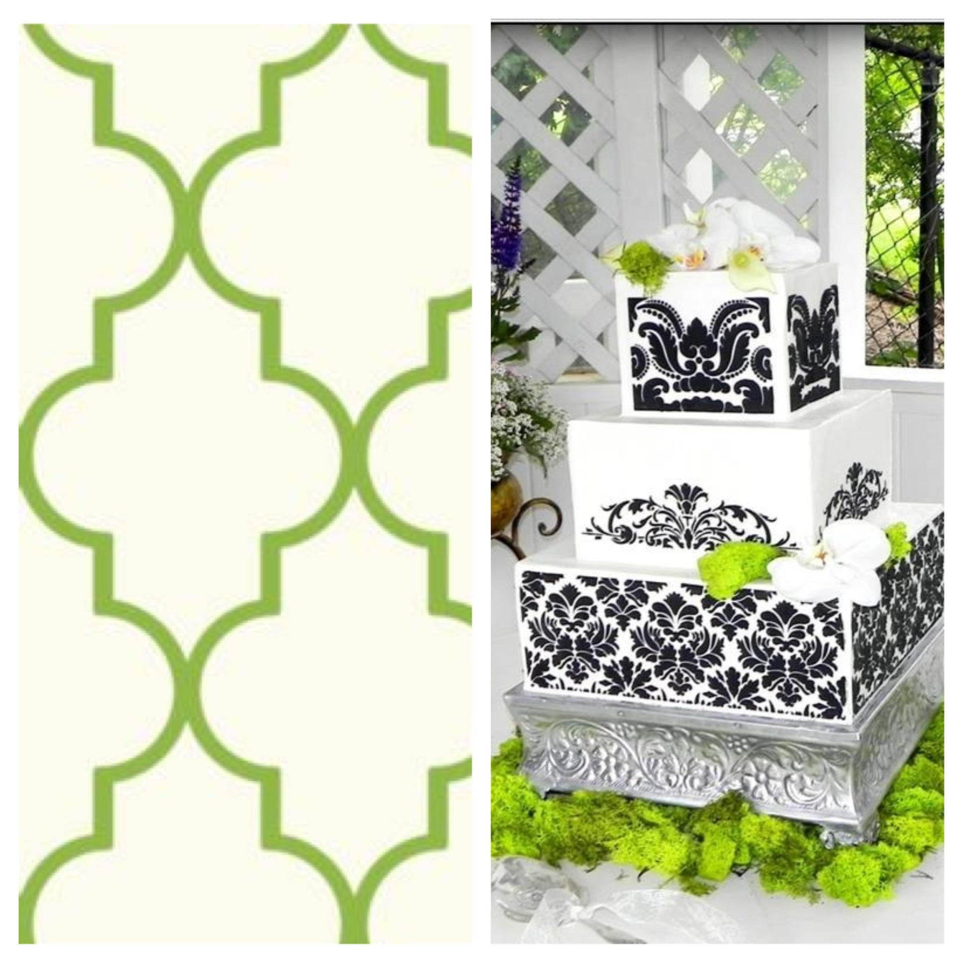
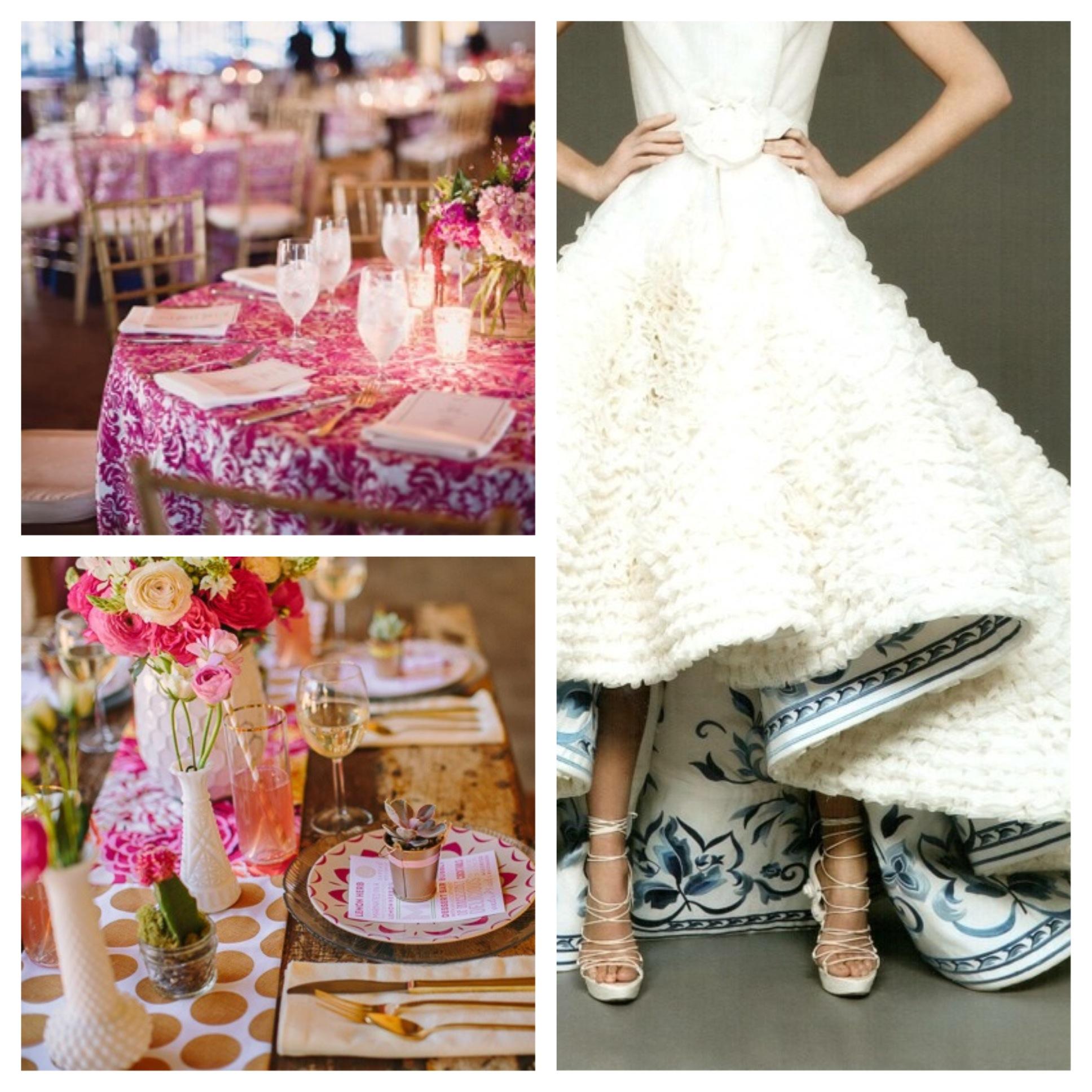
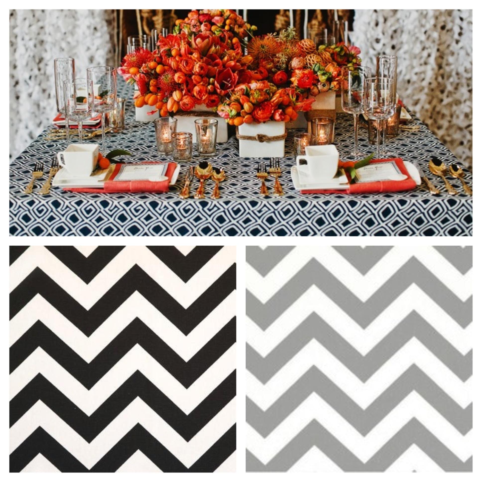 Photo Credit: onetowed.com, saltcitycake.blogspot.com, ruffledblog.com, dawnphoto.com, brides.com, decorpad.com, apartmenttherapy.com, hollymathisinteriors.com

